Update on texturing
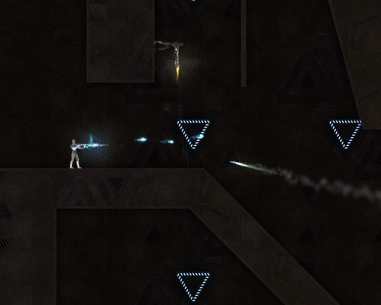
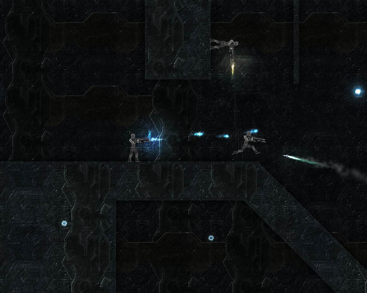
A few weeks ago I posted some info about texturing along with a few screenshots. Today I wanted to show you new textures I’ve been working on yesterday and today and also make a short note about the changes in my texturing concept that took place over the last three weeks.
For your convenience I’ll start with the interesting part and then go to more boring things regarding my own thoughts and techy stuff.


The above mix may seem to have the contrast broken a little bit when you compare it with the first mix but making adjustments in this field is no longer a problem and it’ll be easy to sort out when we can see these patterns in game on actual levels.
The cool thing about the new patterns is that they are very easy to manage. I can easily change their color to whatever I want, I can edit the texture and the details won’t get messed up after that, I can finally add as many or as little details as I want and they won’t mess the texture. I was looking for best solution to that for quite a long time, result being that all previous patterns I made have quite a messy and hard to manage structure but that’s not an issue anymore. The funny thing is that even though I’ve spent ages on finding the most efficient way to make the patterns while doing them, I figured the solution during making Warp Speed website design and Vector Victor that was also introduced recently, rather than the actual patterns. Then I just implemented these ideas into texturing and after a few hours I came up with the results you can admire above.
Remember that we’ll be releasing an alpha version shortly so stay tuned and do not miss out on all the fun!
You must be logged in to post a comment.